T4K3.news
Google Phone app beta expands with M3 Expressive redesign
Version 185 of the Google Phone app brings updates to navigation and user interface features.


Google Phone app introduces changes in its beta version, enhancing user experience.
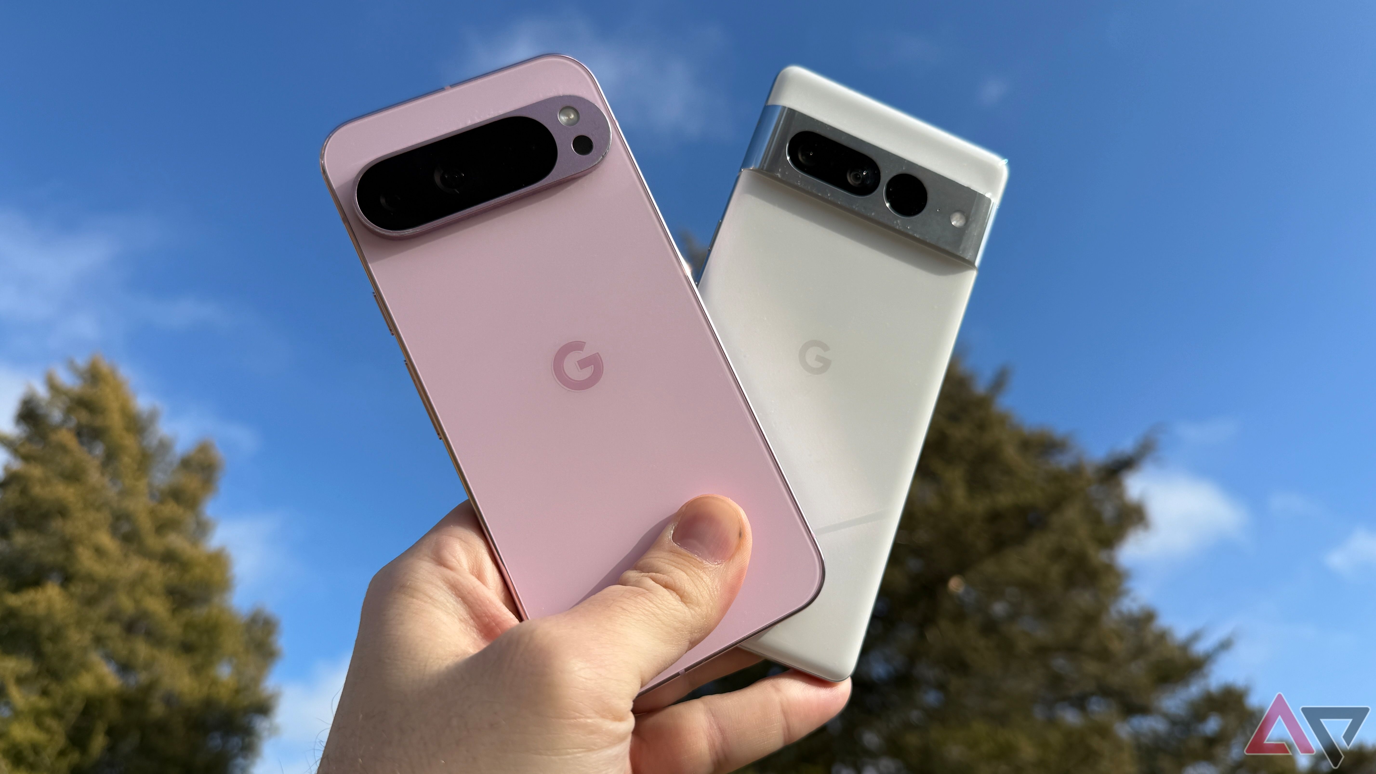
Google Phone app embraces M3 Expressive redesign
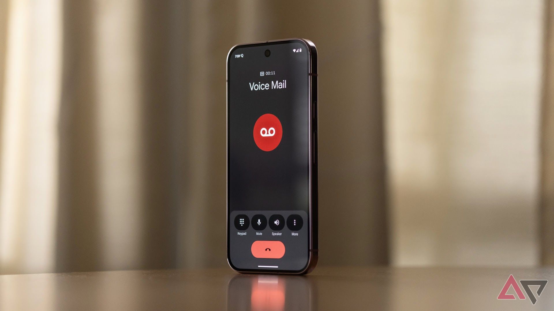
The beta rollout of M3 Expressive in the Google Phone app has advanced with version 185. This update merges the 'Favorites' and 'Recents' tabs into a carousel at the top of the redesigned 'Home' feed. Additionally, the app has replaced the dialer floating action button with a 'Keypad' tab in the bottom bar. While the voicemail feature remains unchanged, a navigation drawer now includes Contacts, Settings, Clear call history, and Help & feedback. Some users have reported experiencing a mix of old and new UI layouts, reflecting a staggered rollout. The M3E Settings page allows users to select incoming call gestures, and the in-call interface showcases new design elements. The broader availability of the updated tabs is anticipated soon, as Google aims for a more cohesive launch.
Key Takeaways
"The integration of 'Favorites' and 'Recents' reflects a response to user feedback."
This highlights Google's intention to improve user experience by simplifying navigation.
"A smoother layout doesn't always come with predictable results."
This underscores the potential confusion caused by the staggered updates.
Google's redesign of the Phone app reflects a broader trend in user interface evolution, aligning with contemporary preferences for streamlined navigation and accessibility. The integration of the 'Favorites' and 'Recents' tabs is a response to user feedback for a more intuitive experience. As tech companies continuously refine their applications, this change may create expectations for smoother updates in the future. However, the chaotic rollout of features may frustrate some users who receive mixed experiences in the interim. This approach to gradual implementation illustrates the challenges of balancing innovation with user satisfaction.
Highlights
- A smoother layout doesn't always come with predictable results.
- Mixing old features with new can create a chaotic user experience.
- Innovation in design requires careful consideration of user feedback.
- The future of apps lies in seamless navigation and accessibility.
Risk of User Confusion Over Updates
The messy rollout of new features may alienate users who prefer a consistent experience. Mixed layouts can frustrate and confuse users, as they navigate between old and new designs.
As Google continues to refine its Phone app, user feedback will play a vital role in shaping future updates.
Enjoyed this? Let your friends know!
Related News
iOS 26 public beta is live
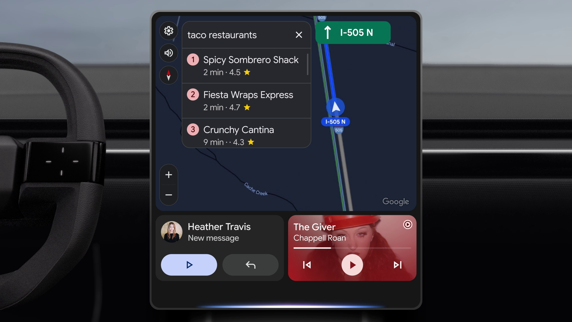
Google's Phone app redesign now widely available
New Safari could challenge Chrome's market share
Google reveals new Call Message feature in Phone app

Google Messages redesign launched
New product announcements at Made By Google 2025
Google Keep redesign rolls out
Apple announces updates for iOS 26 Developer Beta 3