
T4K3.news
Google Messages redesign launched
Google has rolled out a new fullscreen Details page in the Messages app with enhanced features.


Google has revealed a new design for the Messages app's Details feature, enhancing user interaction and clarity.
Google Messages redesign enhances user experience
Google is introducing a new design for the Messages app's Details section, utilizing Material 3 Expressive design principles. This update offers a fullscreen view when users long-press a message and select 'View details.' The revamped layout presents a clearer preview of the message, improving the overall screenshot quality. Additionally, the new 'Status' indicators display whether a message has been Read, Delivered, or Sent. However, the redesign does not include information on message type or priority, which some users may find lacking. The update is gradually available for stable and beta versions of Google Messages.
Key Takeaways
"This redesign enhances how users interact with their messages."
An overview of how the new design improves user interaction with the app.
"The clarity of message statuses helps users navigate communication more easily."
Describes the practical benefits of clear status indicators.
This redesign reflects Google's commitment to enhancing user experience through cleaner interfaces. The adoption of Material 3 Expressive may set a precedent for future updates across apps. While the new message delivery status indicators clarify communication, concerns may arise over the omitted details such as message type and priority. Users accustomed to these indicators might expect to see similar upgrades throughout the app. As Google continues to innovate, the need for balance between simplicity and functionality remains crucial.
Highlights
- A cleaner interface leads to a better user experience.
- Redesigns should balance clarity and essential information.
- Google is streamlining communication with clearer message statuses.
- The omission of message type details raises user concerns.
Potential user backlash over missing features
Some users might express frustration regarding the absence of key details like message type and priority, which could lead to criticism of the update.
As Google evolves its messaging platform, user feedback will play a critical role in shaping future updates.
Enjoyed this? Let your friends know!
Related News
iOS 26 public beta is live
New product announcements at Made By Google 2025
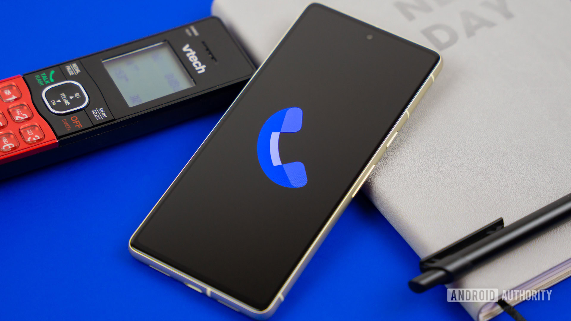
Google's Call Message feature gaining attention

Apple reveals iPhone 17 expected launch date

T-Mobile launches T-Satellite service for satellite messaging
Gmail launches subscription management tool

iOS 26 public beta to release soon
Samsung replaces classic DeX mode with new version in One UI 8