T4K3.news
Android Auto updates with adaptive design feature
Google's Android Auto now changes color schemes to match user wallpapers in new beta rollouts.

Android Auto enhances user experience with a new color-matching feature.
Android Auto embraces a new look with adaptive design
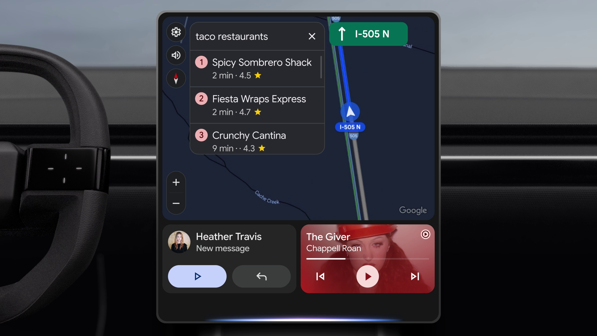
In recent updates, Google's Android Auto has introduced a new feature that allows its color scheme to adapt based on the user's wallpaper, thanks to the Material 3 Expressive design scheme. This change was observed in beta build 14.9, highlighting Google's effort to maintain a consistent aesthetic across its platforms. While this update might seem small, it is part of a broader initiative to enhance user interaction with the application. Although Android Auto may not be a primary focus for Google compared to other apps, these minor adjustments reflect the company's understanding of the importance of user interface consistency across its ecosystem. Reports suggest some users might already see this update in stable versions, indicating a gradual rollout to wider audiences.
Key Takeaways
"A new design feature changes Android Auto's color scheme depending on your wallpaper."
This highlights the application’s effort to match aesthetics across devices.
"It's these sorts of touches that make a difference when you're looking at interfaces like this though."
The quote emphasizes the importance of user interface details that enhance overall experience.
"Google understands the significance of continuity across different versions of Android."
This reflects the company's commitment to a unified user experience across its platforms.
The update to Android Auto aligns with Google's broader ambitions of refining user experience and interface across its platforms. By allowing the application to match colors to the user's wallpaper, Google not only enhances aesthetics but also strengthens brand cohesion. This move is notable because it reflects a growing trend among tech companies to personalize user interactions and would possibly lead to higher satisfaction and engagement. As more features, including a light mode and advanced control options, are on the horizon, Android Auto is positioning itself as a more integrated part of the connected car experience.
Highlights
- Adaptive design is the future of user experience.
- Subtle changes can create lasting impressions.
- Google's attention to detail is commendable.
- Color adaptation is a step forward for Android Auto.
Potential user backlash over gradual rollouts
As Google introduces these updates in phases, users may be frustrated if features are not available immediately, leading to mixed reactions.
As Google continues to develop Android Auto, user experience will likely be at the forefront of future updates.
Enjoyed this? Let your friends know!
Related News
Samsung replaces classic DeX mode with new version in One UI 8
New Safari could challenge Chrome's market share
Apple launches iOS 26 with Liquid Glass interface
Google Photos introduces new video editing tools
Android continues to evolve with new technologies
Google plans to integrate Android and ChromeOS
Samsung plans Auto DeX as Android Auto alternative
Samsung Galaxy Z Flip 7 launched with new features