
T4K3.news
Pixel Watch Fitbit app gets Material 3 makeover
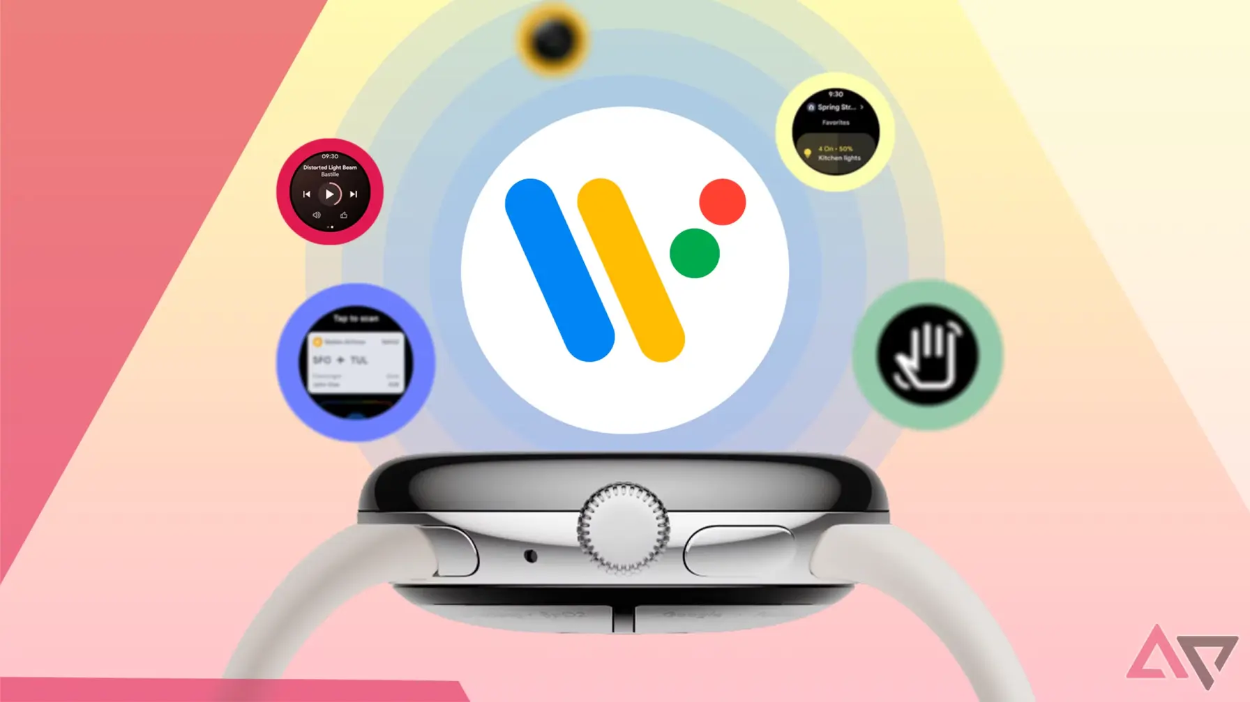
The Fitbit app for Pixel Watch now uses Material 3 Expressive with new icons, tiles, and Morning Brief; rollout is staged to Pixel Watch 1 2 and 3.

The Fitbit app for Pixel Watch receives a Material 3 Expressive redesign with brighter colors, updated icons, and refreshed tiles.
Fitbit app on Pixel Watch gains Material 3 Expressive makeover
Pixel Watch users get a fresh look for the Fitbit app thanks to a Material 3 Expressive redesign. The update brings rounder typography, a brighter color palette, and updated tiles across the interface, including the Morning Brief and exercise tracking screens. The rollout is staged and headed to Pixel Watch 1, 2, and 3 models, with version 3.40.1.794050398 appearing on testers’ devices. Icons in the app drawer now use a white background with colorful gradients, and the graphs and cards feature bolder colors for easier reading.
Users will notice less grey and more readable elements. Some tiles display the full daily goal and remaining steps, while others show fewer details. The multicolor sleep graph replaces a single purple line. The changes align Fitbit with Wear OS’s push for Material 3 across apps, aiming to make glanceable health data easier to read at a glance.
Key Takeaways
"Material 3 on the wrist finally feels expressive"
A quick take on the visual shift
"Bold colors replace grey and the numbers tell the story"
Comment on readability and data emphasis
"Morning Brief now reads like a compact health briefing"
Observation of the updated Morning Brief feature
"Pixel Watch users will see a more cohesive design across apps"
Implication for ecosystem consistency
The redesign signals a broader shift for Wear OS toward Material 3 Expressive. Designers emphasize readability and quick interpretation on small screens, which matters for fitness data. The change may set a standard for how wearable apps present information, with larger fonts and clearer color coding.
A staged rollout is practical, but it can create uneven experiences as features appear on some devices before others. It also raises questions about accessibility for users with visual impairments if color cues carry more weight. Overall, the move could push other partners to refresh their apps and push Google toward a more cohesive ecosystem.
Highlights
- Material 3 on the wrist finally feels expressive
- Bold colors replace grey and the numbers tell the story
- Morning Brief now reads like a compact health briefing
- Pixel Watch users get a cohesive look across Fitbit and other apps
The update sets a new baseline for how wearable apps present health data on the wrist.
Enjoyed this? Let your friends know!
Related News
Fitbit Wear OS redesign underway
New product announcements at Made By Google 2025
Google Gemini update now available for Wear OS users
Grab the Pixel Watch 3 at a record low price
Pixel Watch 4 set for August 20 launch with exciting features
Pixel Watch 4 specs leak reveals limited upgrades
Google's Pixel Watch 4 pricing leaked ahead of launch
Pixel Watch 3 edges out Galaxy Watch 8 in accuracy test