T4K3.news
Fitbit Wear OS redesign underway
Google begins rolling out Material 3 Expressive updates to the Fitbit Wear OS app with server-side activation.
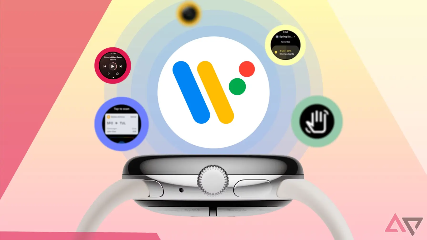
Google updates Fitbit Wear OS app with Material 3 Expressive visuals as part of a wider ecosystem refresh.
Fitbit Wear OS redesign signals larger Google design push
Google's Material 3 Expressive is moving into the Fitbit Wear OS app. Android Police notes that new app icons are rolling out for Fitbit Exercise, Fitbit Relax, and Fitbit Today, featuring lighter colors, gradients, and a white background instead of the old silhouettes on colored panels. The changes appear in both the icon view and the list views in the Wear OS app drawer. New tiles with bigger, bolder elements are also visible in the Pixel Watch app, though they are not live on the watch side yet. The rollout is staged and appears to be activated by a server switch rather than a universal update.
This update is part of a broader push by Google to align Wear OS apps with Material 3 Expressive. Earlier changes included updates to Chrome for Android and Files, with Phone and Messages following, all signaling a wider refresh across Google’s wearable ecosystem. The changes come as Wear OS 6 and the Pixel Watch 4 loom on the horizon, suggesting Google is betting on a cohesive design language across devices while pushing a phased rollout that some users will encounter sooner than others.
Key Takeaways
"Google bets on bubbly visuals to unify its devices."
Commentary on strategy and branding across devices.
"Wear OS gets a brighter, more tactile interface."
Observation of the design update.
"A phased rollout means changes arrive at different times."
Rollout strategy note.
"Pixel Watch 4 could carry this familiar look forward."
Forward-looking implication for devices.
The shift to Material 3 Expressive reflects a deliberate move to unify Google’s look across devices. The new visuals emphasize depth, gradients and larger touch targets, which can improve readability on small screens and create a more modern feel. If successful, the change could make the wearable experience feel more connected to Google’s other products.
However, the rollout poses risks. A phased, server-side switch means some users will see the new style before others, potentially fragmenting user experience during the transition. It also raises questions about how much identity Fitbit or Wear OS keeps within Google's broader design system as visual defaults become more dominant across apps.
Highlights
- Google bets on bubbly visuals to unify its devices.
- Wear OS gets a brighter, more tactile interface.
- A phased rollout means changes arrive at different times.
- Pixel Watch 4 could carry this familiar look forward.
Design is becoming the thread that ties Google's wearable family together.
Enjoyed this? Let your friends know!
Related News
Pixel Watch Fitbit app gets Material 3 makeover
Grab the Pixel Watch 3 at a record low price
Google Gemini update now available for Wear OS users
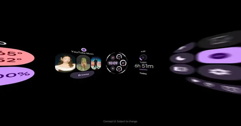
Google Calendar adds M3 Expressive tiles to Wear OS
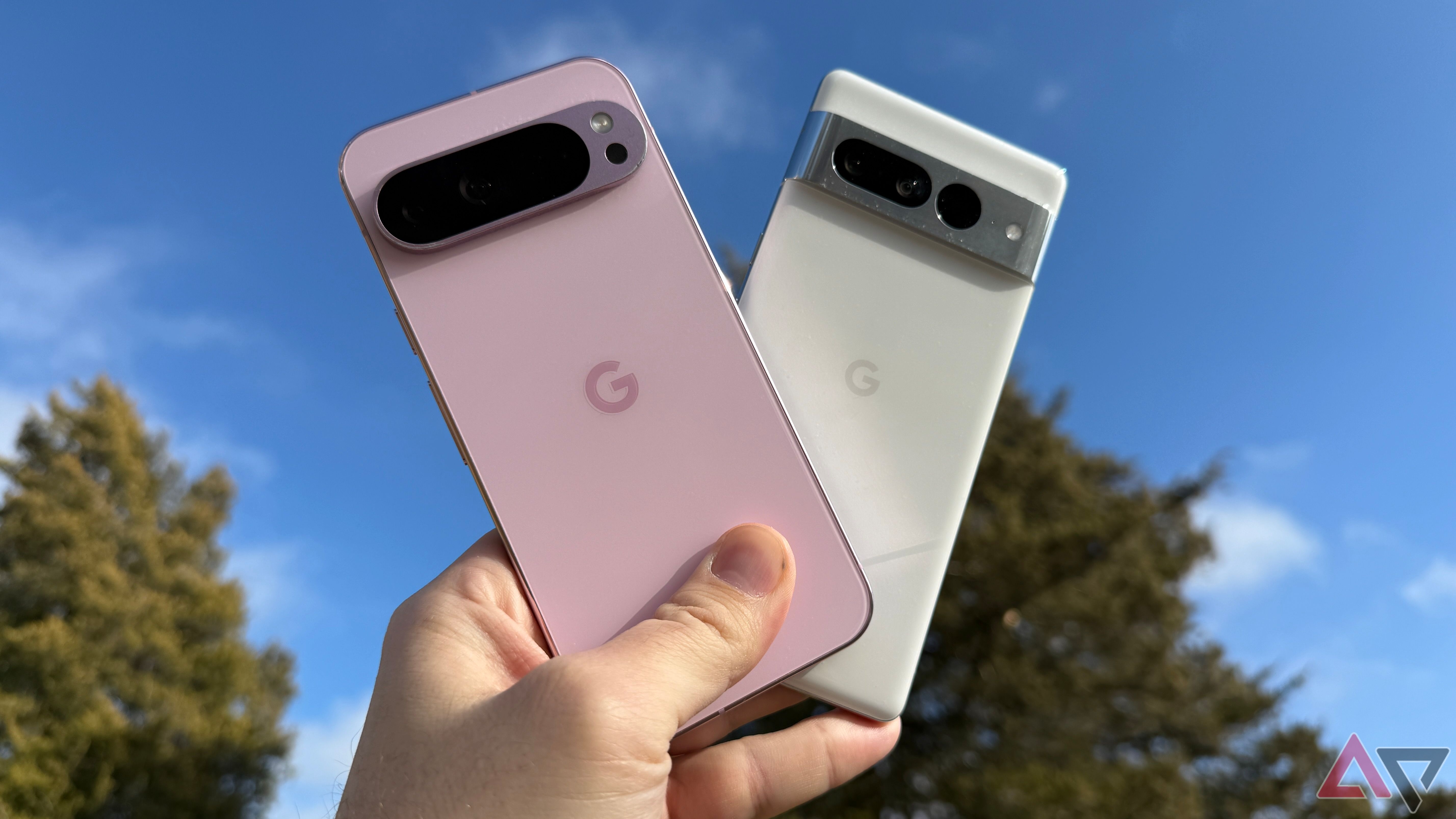
New product announcements at Made By Google 2025
Pixel Watch 4 leaks reveal major upgrades
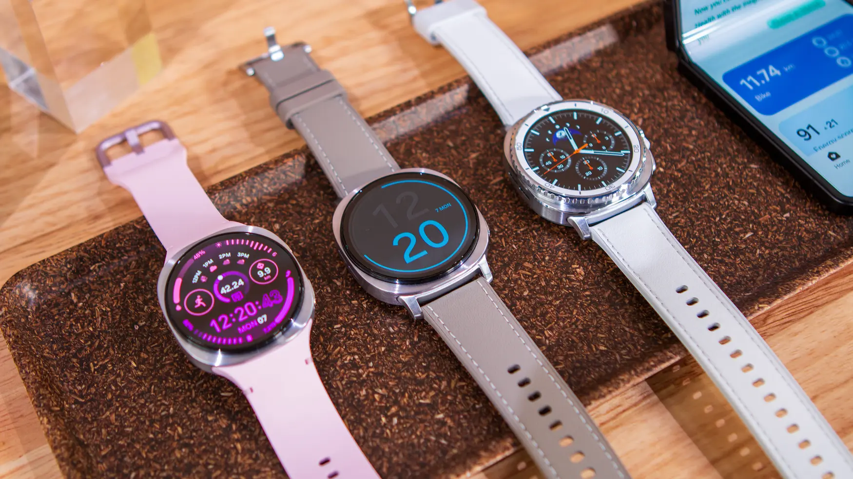
Samsung Galaxy Watch 8 and 8 Classic announced
Google Home for Wear OS adds custom Favorites feature
