T4K3.news
Android Auto expands app drawer to seven columns
Google tests a larger app grid on Android Auto, enabling more apps to be visible on bigger displays.
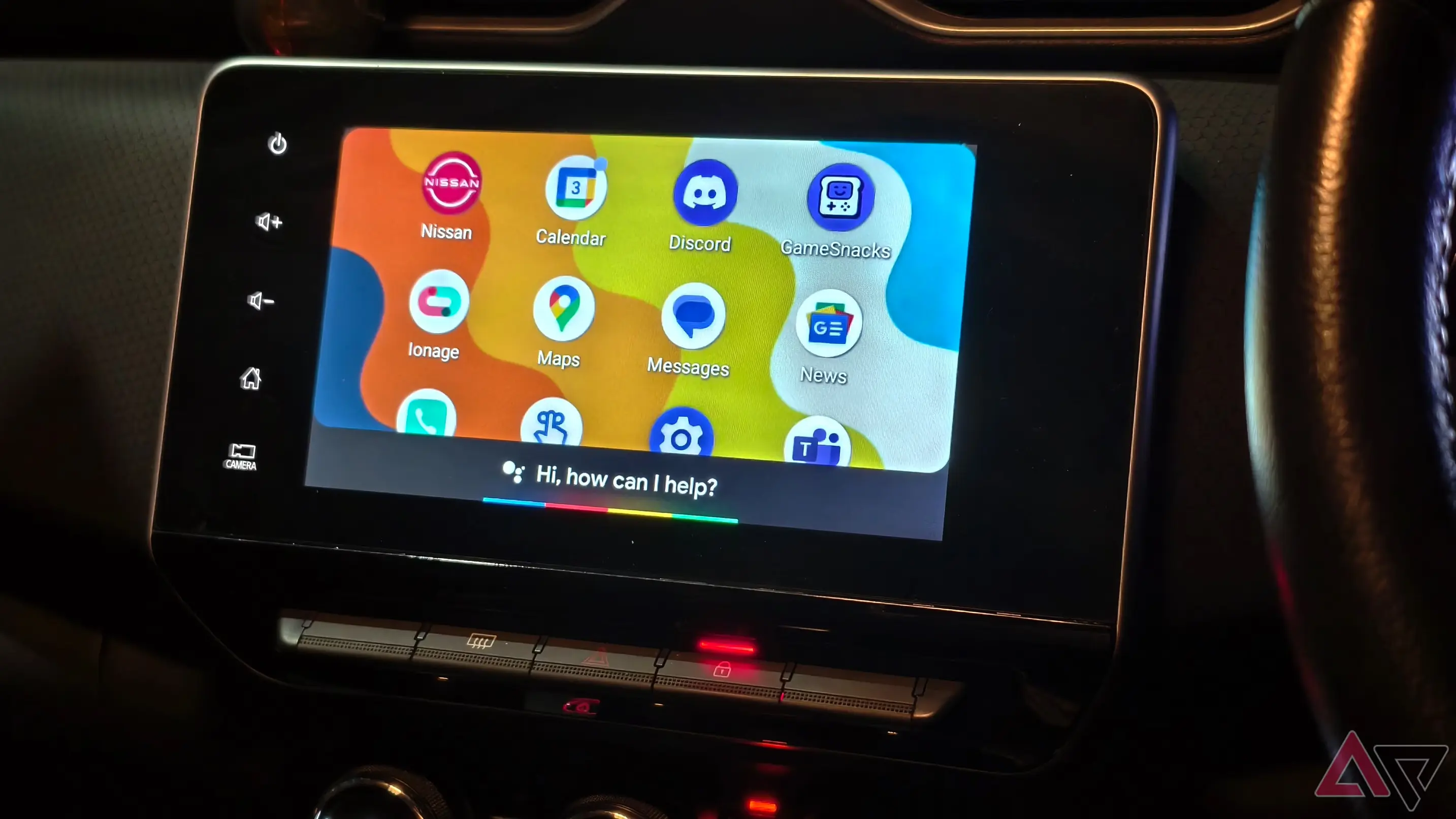
A teardown reveals Google's plan to widen the Android Auto app drawer, increasing visibility on larger car displays.
Android Auto expands app drawer to seven columns
Android Auto currently shows about four to five app drawer columns, depending on display size. A teardown by Android Authority uncovered a hidden setting that can expand the drawer to seven columns, suggesting Google is testing a larger grid for quicker app access. There is no official confirmation yet on final limits or rollout timing.
The change is framed as a usability improvement for tasks when a driver pulls over or pauses the trip. While more on screen can speed up actions like changing music or switching directions, experts warn that more options may tempt drivers to take their eyes off the road. The upgrade also shines a light on broader Android Auto issues, including reliability and notification handling, which critics say deserve attention alongside new UI tweaks.
Key Takeaways
"Seven columns change the game for quick taps"
Observation on usability gains from a larger grid
"More space on the drawer should not steal attention from the road"
Safety-focused warning about larger grids
"Google must address core Android Auto problems alongside UI tweaks"
Editorial stance on balancing UI with reliability
"Design should serve safety first not screens first"
Principle guiding interface upgrades
The move signals that infotainment design is moving toward more flexible grids. Bigger app drawers can feel efficient, but they also test driver concentration and reaction times.
Beyond the UI, this tweak raises questions about how Google will balance quick access with safety and consistency across different car displays. It also highlights a broader industry shift toward adaptable, modular interfaces rather than fixed layouts.
Highlights
- Seven columns change the game for quick taps
- More space on the drawer should not steal attention from the road
- A bigger grid is not a substitute for safety
- UI growth outpaces patience on the road
The next test is whether this UI tweak actually improves daily use without compromising safety.
Enjoyed this? Let your friends know!
Related News
Samsung replaces classic DeX mode with new version in One UI 8

Smart Launcher emerges as top Android launcher

AirPods gain seven new features with iOS 26

Fitbit Wear OS redesign underway
New 'Expanded' dark mode feature available in Android
Samsung plans Auto DeX as Android Auto alternative
Samsung plans to increase Now Bar app support
Android Auto updates with adaptive design feature
