
T4K3.news
iOS 26 Beta 6 Update
Apple tweaks Lock Screen translucency and clock depth as it nears September release.

Apple continues refining the Liquid Glass design in the iOS 26 beta, focusing on the Lock Screen clock and translucency ahead of the official launch.
Apple Changes Liquid Glass Again in iOS 26 Beta 6
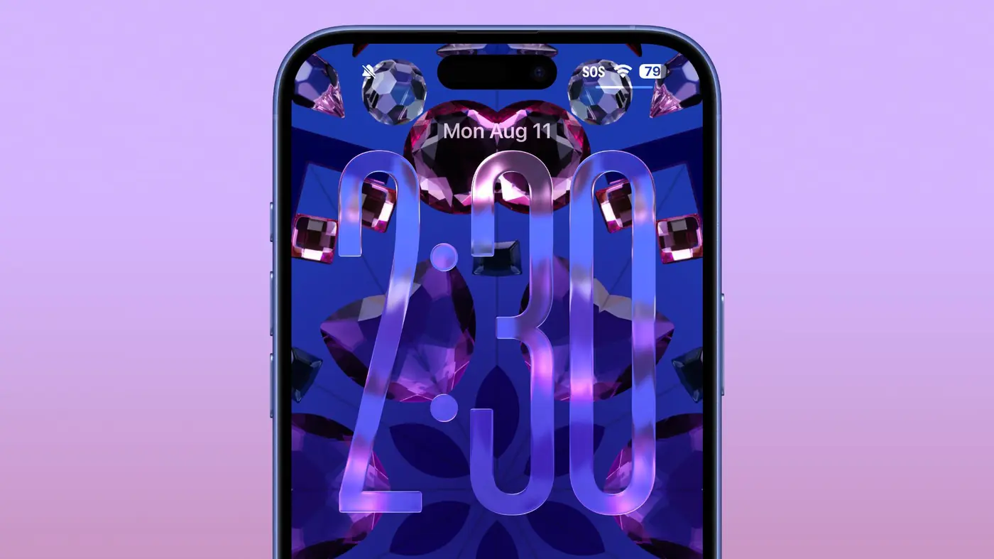
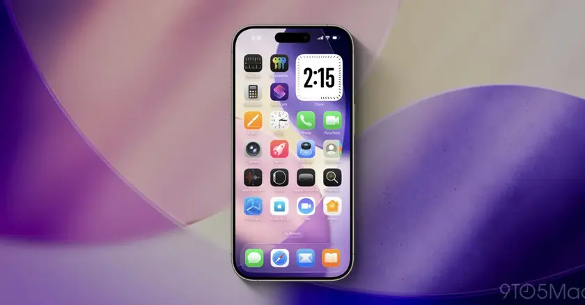
Apple is continuing to refine the Liquid Glass design in iOS 26 beta 6, focusing on the Lock Screen. The updated beta increases the clock’s transparency so more of the wallpaper shows through, and the clock has a slightly more three dimensional, floating feel. The control buttons remain the same, while icons appear larger. Lock Screen widgets remain unchanged. Apple has repeatedly tweaked design elements across the beta cycle as it prepares for a September debut of iOS 26.
Users may notice that the clock is less legible on very dark backgrounds, a reminder that aesthetics can come at the cost of readability. Still, supporters see a more cohesive look that aligns with the broader Liquid Glass concept. The ongoing adjustments highlight Apple’s willingness to test subtle shifts in a crowded field of mobile design.
Key Takeaways
"Liquid Glass finally breathes on the Lock Screen"
Highlighting the new look in beta 6
"The clock floats above the wallpaper, adding depth"
Describes the depth effect in the update
"Apple continues to push aesthetic trials while keeping widgets steady"
Notes ongoing design process
"Readability may dip on darker backgrounds in this phase"
Observes potential issue
Liquid Glass is a bold design move that adds depth and minimalism to iOS. By increasing transparency on the Lock Screen clock, Apple invites the wallpaper to participate in the time display, a step toward a more immersive UI. The risk is legibility, especially for users who prefer high contrast. The changes also show Apple testing how far depth can go before it interferes with quick readability.
This beta cycle shows Apple balancing aesthetic experimentation with practical constraints. The trade off between style and utility will shape the iOS 26 experience at launch. If readers respond to the transparency, Apple may add more customization or a background dependent option in future updates. For now, the Glass remains a design signature in progress.
Highlights
- Liquid Glass finally breathes on the Lock Screen
- The clock floats above the wallpaper like glass
- Design pushes readability for a signature style
- A subtle shift that speaks louder than words
Time will tell how much users notice these subtle shifts.
Enjoyed this? Let your friends know!
Related News
iOS 26 beta 6 released
Apple releases iOS 18.6 beta as launch nears
iOS 26 beta 6 expands iPhone ringtone options
iOS 26 beta 6 speeds up app launches
Apple Launches iOS 26 Beta 5
iOS 26 public beta launching this week
iOS 26 public beta to release soon
Apple bets continue for iOS 26 and iPadOS 26
