
T4K3.news
Google Calculator updated with Material 3 Expressive
Google rolls out Calculator 9.0 with bigger buttons, integrated science functions, and a condensed font.

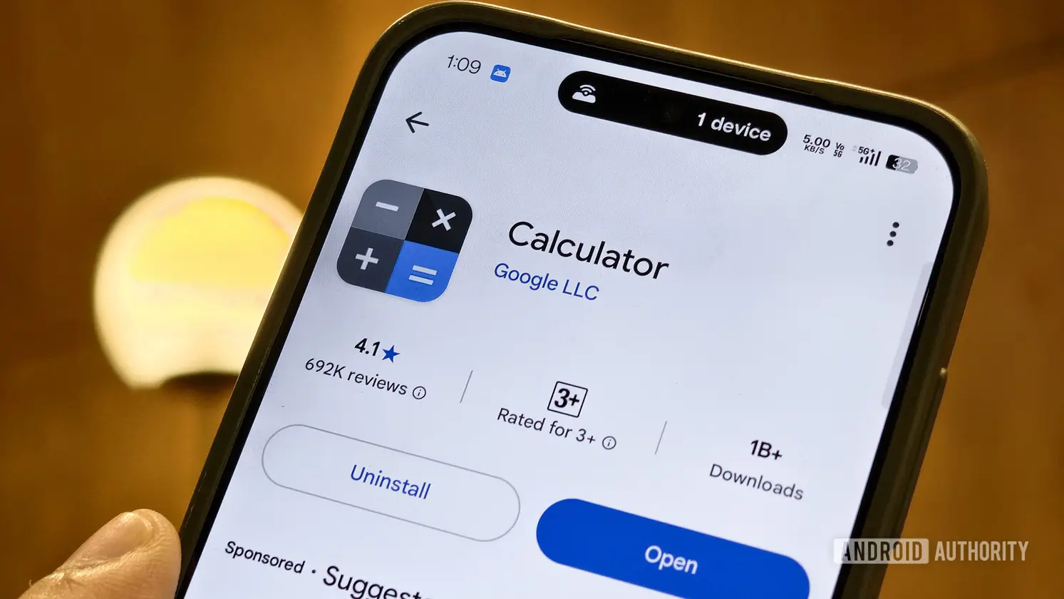
Google updates its Calculator app with Material 3 Expressive design, adding bigger buttons, integrated scientific controls, and a condensed font.
Google Calculator Embraces Material 3 Expressive Redesign
Google has rolled out Calculator 9.0 with a Material 3 Expressive design. The update makes the number buttons larger and places them closer to the screen edge. The top row that includes square root, pi, power and factorial is now integrated into an expanded layout, with additional scientific functions revealed by tapping arrows. Individual enclosing buttons replace the old icon on a borderless space, creating a more cohesive look and feel.
The overflow menu gains icons that complement the text, matching changes Google has been applying across apps in the Expressive family. A new condensed font for numbers gives a more calculator like impression while maintaining a modern aesthetic. The update is part of a broader rollout and is available on devices via the Play Store or APKMirror for those who have not yet received the update.
Key Takeaways
"The update makes everyday calculations feel smoother."
General reaction to the UI refresh.
"Larger numeric buttons reduce tapping errors."
UI benefit observed.
"Google is pushing consistency across its apps with Material 3 Expressive."
Editorial observation on strategy.
The redesign signals Google’s push for consistency across its Android apps and a renewed focus on readability. Bigger buttons and a tighter font can reduce errors, but they also take up more space on small screens. The trend toward icon plus text in menus can help quickly identify options, though it may clutter smaller devices. This move sits within a wider strategy to unify visual language across Google apps, which could strengthen brand coherence but may frustrate users who preferred legacy layouts.
As Material 3 Expressive expands beyond core apps, designers face the challenge of balancing bold visuals with practical usability. Calculator users will judge not just the look but the feel of tapping and reading on a screen that now aims for both familiarity and freshness. The outcome will depend on how well the changes translate into everyday accuracy and speed, not just aesthetic appeal.
Highlights
- Bold buttons sharpen the touch feel
- A condensed font nods to classic calculators
- Icons with text tidy up the overflow menu
- Expressive design signals a wider Google app strategy
Design shifts like this test how much look shapes usage and comfort.
Enjoyed this? Let your friends know!
Related News

Google Keep redesign rolls out
Pixel Sounds adds Expressive design

Fitbit Wear OS redesign underway

Google updates editor UI with Material 3 Expressive tweaks

Google's Phone app redesign now widely available
Pixel Drop Extends Material 3 Expressive to Pixel Family
Google reveals new bouncy design for Gemini overlay
Pixel Android 16 QPR1 update