
T4K3.news
Gemini overlay gains a bubbly redesign on Android
Google rolls out a circular entry that grows into a full width pill while preserving the main controls.

Google updates the Gemini overlay on Android with a circular entry that expands into a full width pill while keeping key controls.
Gemini overlay gains a vibrant bubbly redesign on Android
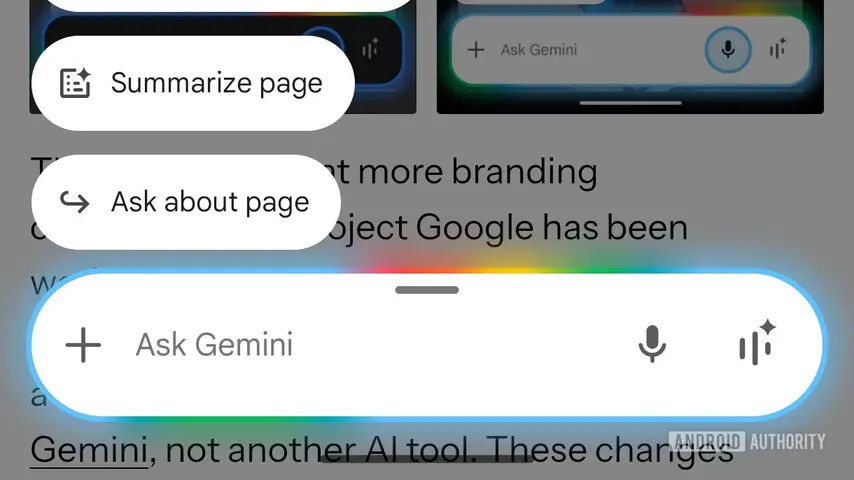
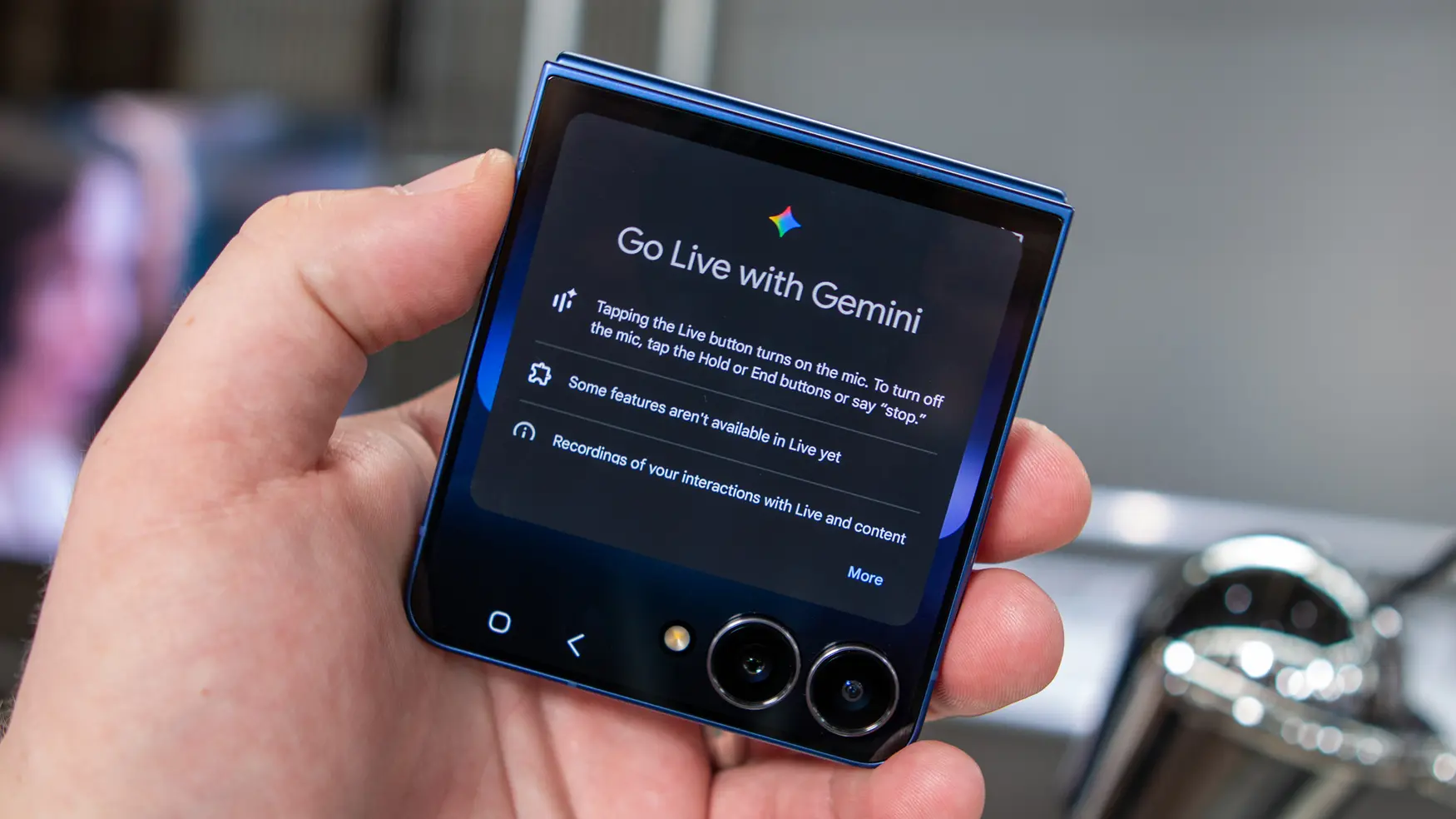
Google is rolling out a new Gemini overlay for Android after the four color glow. The redesign moves from a bottom bar to a circle that slides in from under the gesture bar and expands into a full width pill. The change alters the visual rhythm while keeping the plus menu, the Ask Gemini hint, the voice input microphone, and Gemini Live intact. The glow colors stay the same, ensuring brand continuity.
The Share screen with Live chip also becomes a pill. Observers describe the look as more bubbly and vibrant, contrasting with the older stilted animation. Availability is currently limited, with a broader rollout expected soon after the previous redesign in January.
Key Takeaways
"The redesign feels more bubbly and friendly"
Designer notes on the new vibe of the Gemini bar
"The circle to pill entry is functional while staying visible"
UX engineer explaining the layout logic
"If this sticks it could set a new standard for Gemini across devices"
Tech analyst perspective on design influence
The move toward circular shapes aligns with a broader shift in Google's UI language. This can create a friendlier feel on small devices but may blur lines with other circle based features, potentially confusing users who expected a distinct Gemini look.
The real test will be how quickly users adapt and how it affects discovery of Gemini features. Designers will watch usage data and feedback to decide if the bubbly look stays.
Highlights
- The circle to pill move feels intentional and approachable
- A bubbly vibe can boost quick access for casual users
- Design shifts like this test our sense of space on small screens
- Keeping the core controls shows Google respects user habits
Design tests will show if the bubbly style wins over established familiarity.
Enjoyed this? Let your friends know!
Related News
Google reveals new bouncy design for Gemini overlay
Samsung showcases Gemini while Google announces Android updates
Fitbit Wear OS redesign underway
Google Wallet overlay expands on Pixel
Samsung Galaxy Z Flip 7 launched with new features
Apple iPhone 17 leaks suggest big design changes

Apple Responds to DoJ Antitrust Lawsuit
Android Rewind website launches