T4K3.news
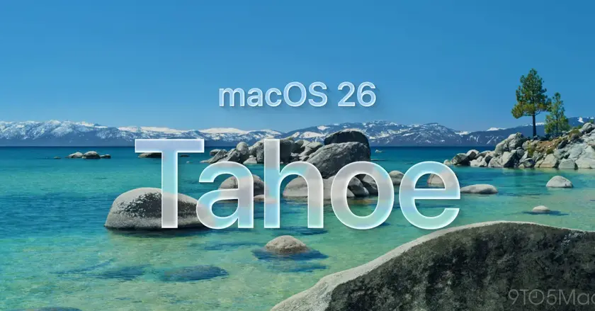
Apple updates Macintosh HD icon in macOS 26 Tahoe
The iconic Macintosh HD hard drive icon has been replaced with a modern design.

The familiar Macintosh HD hard drive icon has been updated in the latest macOS.
Apple bids farewell to the Macintosh HD hard drive icon
Apple's latest developer beta of macOS 26 Tahoe introduces a fresh design for the long-standing Macintosh HD hard drive icon. This new icon replaces the classic representation of a spinning hard drive with a more modern depiction resembling solid-state drives. The change comes after years of dwindling visibility for the old icon, as new installations of macOS have not displayed the internal disk on the desktop by default for some time. Originally launched in 2000, the previous icon received only minor updates over the years, including a Retina resolution upgrade in 2012 and a more subtle redesign in 2014, reflecting Apple's evolving aesthetics toward simpler and flatter design.
Key Takeaways
"The change to the Macintosh HD icon reflects a shift in technology toward newer storage solutions."
This quote emphasizes how the visual update signals a move away from older hardware.
"Replacing a beloved symbol highlights Apple's blend of nostalgia with innovation."
This opinion showcases the tension between nostalgia and modern design in tech.
The replacement of the Macintosh HD icon signifies more than just a visual update; it marks the end of an era characterized by physical hard drives. As Apple embraces solid-state technology, this change highlights a broader trend in computing towards more efficient and compact storage solutions. While nostalgic users may mourn the loss of a familiar symbol, the shift aligns with the rapidly changing landscape of technology that prioritizes speed and simplicity. The decision to modernize the icon now signals Apple's commitment to staying relevant in an era where the hardware has evolved significantly.
Highlights
- Out with the old, in with the sleek and modern.
- Every icon tells a story, but some stories must come to an end.
- Goodbye spinning rust, hello solid-state innovation!
- Legacy meets modernity in Apple's latest update.
Potential backlash over design changes
Users nostalgic for the original Macintosh HD icon may criticize its removal as another loss of Mac heritage.
As technology progresses, even the icons of our past must adapt and evolve.
Enjoyed this? Let your friends know!
Related News
macOS Tahoe 26 beta 5 changes Macintosh HD icon

Apple Launches iOS 26 Beta 5

New features in macOS 26 Tahoe public beta released

iOS 26 introduces Liquid Glass design overhaul
macOS Tahoe introduces iPad-inspired changes

New features launched in macOS 26 Tahoe

New Shortcuts features are coming in iOS 26

Apple's public betas for new software available now