T4K3.news
Toaplan Collection Flubs Draw Criticism
Toaplan Arcade Collection volumes 1 and 2 face packaging questions as fans flag missing logos and punctuation on Switch editions.

Consistency gaps in packaging and branding for Toaplan arcade releases prompt questions about QA and publisher collaboration
Toaplan Collection Flubs Draw Criticism
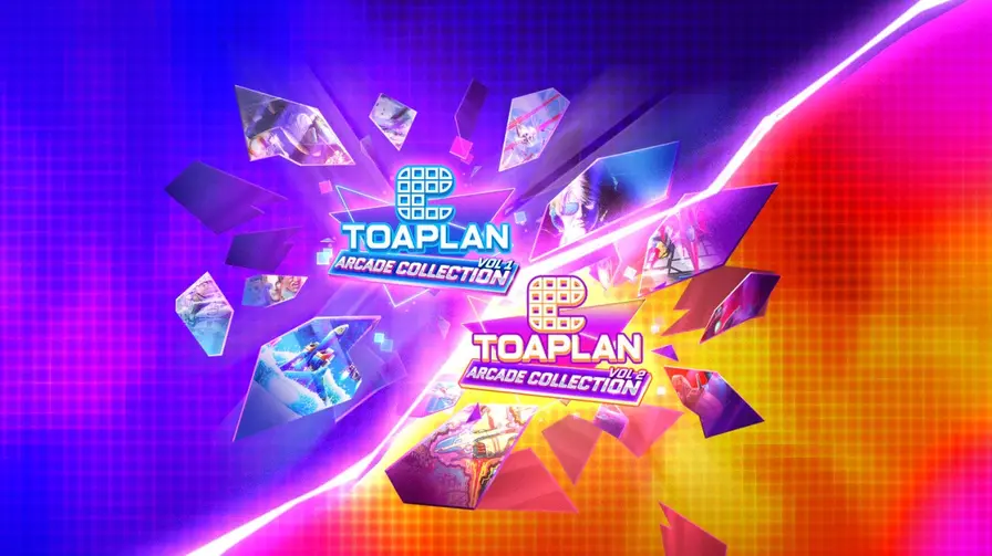
Tatsujin, the rights holder behind Toaplan, has pushed a new wave of arcade collections onto Nintendo Switch in both digital and physical formats. The two volumes, Toaplan Arcade Collection Vol 1 and Vol 2, are released through Clear River Games, with Vol 2 also appearing on other storefronts. Observation from the community shows minor but noticeable packaging details: the Vol 1 spine lacks the Switch logo, while Vol 2’s listing omits a full stop after Vol, a punctuation choice Vol 1 does include. A social media post captured the moment, prompting wider discussion about quality control in multi platform releases.
The episode draws a line to past packaging slips in the industry, such as Capcom’s Okami cover with the IGN logo shown by mistake and Resident Evil Revelations misspelling, underscoring that even big brands can misstep on presentation. While the games themselves remain the focus, the packaging and branding details shape how collectors perceive a release and can affect trust in the publisher and rights holder.
Key Takeaways
"Come on guys, get your act together"
Quoted reaction from Bluesky user billycupid about the packaging on Vol 1
"People are going to start thinking you’ve just shat out a couple of half-baked collections on the cheap"
Direct comment from the same social media post criticizing the releases
"Quality control matters as much as the games themselves"
Editorial remark tying packaging to game quality
The case highlights a broader problem in today’s multi platform releases: more channels mean more opportunities for small errors to slip through. In a market that prizes accurate branding for collectors, even tiny omissions can erode confidence and invite backlash. The episodes also reveal how partnerships between rights holders and publishers are tested by shared responsibilities for QA across physical and digital editions.
Going forward, Clear River and Tatsujin could benefit from a simple, centralized QA checklist that covers logos, typography, and punctuation across all formats. Strengthening those basics protects the catalog’s legacy and supports future collaborations with retailers and fans alike.
Highlights
- Attention to detail is part of the game
- Brand trust lives in the small prints and logos
- A single typo can cost a label a loyal fan base
- Publishers prove they respect collectors with care
Public backlash on Toaplan packaging in releases
The criticism on social media and the visible packaging oversights raise sensitivities around QA and brand reputation. If not addressed, this could affect future licensing and retail partnerships.
Consumers will judge the next batch by the care shown in the packaging
Enjoyed this? Let your friends know!
Related News

A Minecraft Movie shatters box office records
Mafia The Old Country frames a return to roots

NASA plans to end crucial carbon-monitoring missions

Gradius Origins lands on Switch

Legends Z A Battle System Preview
Debate Surrounds Ethics of Modern Parenting

Weekend film slate offers strong mix

Meghan in talks for new Netflix contract after £73 million deal