T4K3.news
Samsung Galaxy Z Fold 7 users discover a simple fix for notifications
Users can change lock screen settings in One UI 8 to make notifications more visible.

Notifications aren't noticeable enough by default in One UI 8, but it's an easy fix
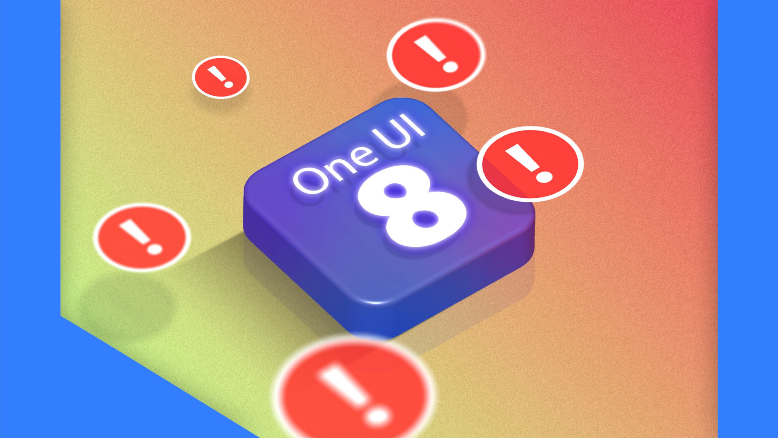
One UI 8 notifications lack visibility without a simple adjustment
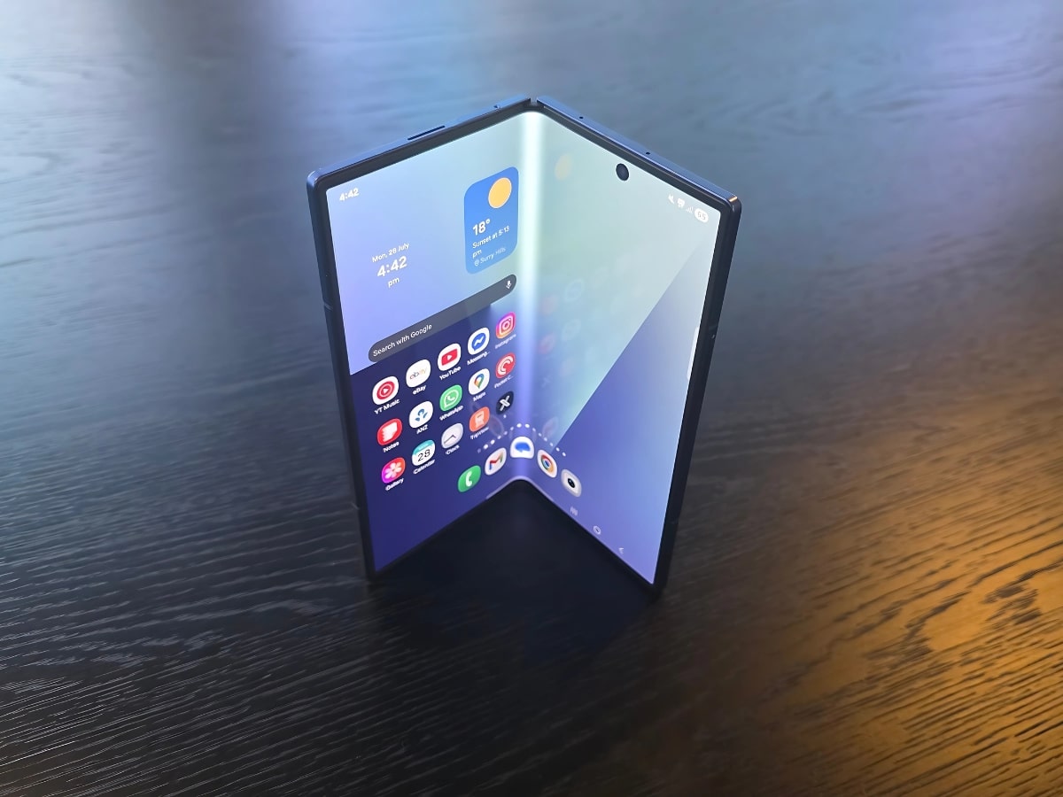
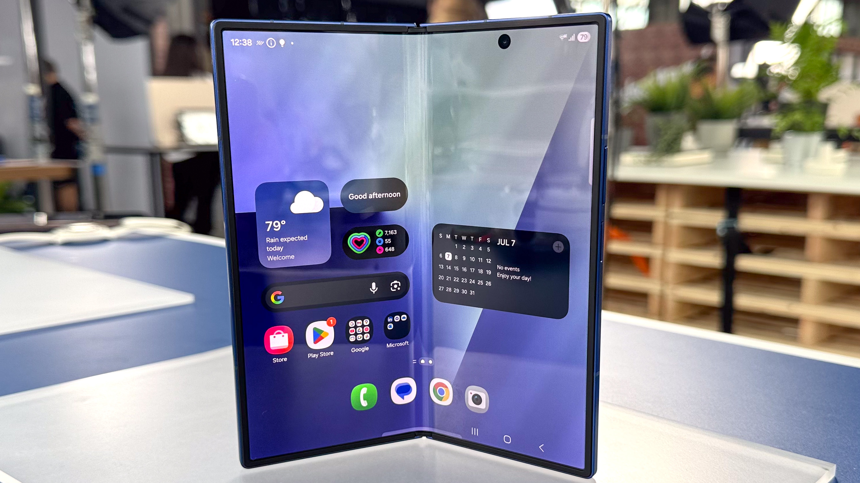
Users of the new Samsung Galaxy Z Fold 7 are likely to discover that notifications in One UI 8 are not prominently displayed on the lock screen. By default, notifications appear as small icons in the upper-left corner, which limits visibility. This issue is not new, as it was also present in One UI 7. Many users may not even realize they have the option to change these settings, missing important messages if they don't make the adjustment. Fortunately, users can switch to a card-based notification layout that shows alerts more visibly in the center of the screen. This simple update significantly enhances usability, making notifications much easier to see at a glance.
Key Takeaways
"Switching from icons to cards for notifications makes my phone more useful to me."
This highlights the importance of making user-friendly adjustments for better functionality.
"The default icons aren’t noticeable enough, making it hard to stay updated with alerts."
This underscores a common frustration among users regarding notification visibility.
The subtlety of notification visibility in One UI 8 reflects a broader trend in smartphone design. While manufacturers aim for sleek aesthetics, functional issues like these can hinder user experience. The decision to hide notifications in one corner may stem from a desire for a clean look, yet it raises questions about prioritizing style over functionality. Users often appreciate features that enhance their day-to-day interactions. Samsung's card-based system offers a practical solution, suggesting that companies should focus not just on how a device looks, but also how it works in real-life scenarios.
Highlights
- A few adjustments can unlock a better experience.
- Visibility is key when it comes to notifications.
- Small changes can lead to big impacts on usability.
- Samsung needs to prioritize practicality over aesthetics.
Visibility of Notifications May Affect User Satisfaction
The design choice to hide notifications could lead to user frustration and dissatisfaction, particularly if important messages are missed. Adjusting settings to improve visibility is essential for a positive user experience.
As Samsung evolves its user interface, addressing these usability concerns will be essential for maintaining customer satisfaction.
Enjoyed this? Let your friends know!
Related News
Samsung One UI 8 introduces new features
Samsung unveils foldables and Pixel 10 prototype appears
Top Samsung Galaxy Z Fold 7 screen protectors revealed
Galaxy Z Fold 7 struggles as a laptop alternative
Samsung Galaxy Z Flip 7 now available
Engadget releases reviews for new tech devices
Samsung launches Galaxy Z Flip 7 with mixed reviews
Samsung speeds up Galaxy software updates