T4K3.news
iPhone 17 colors reportedly confirmed
Bloomberg’s Gurman points to orange for Pro and light blue for Air, signaling a bold color strategy ahead.


Bloomberg’s Mark Gurman points to orange for iPhone 17 Pro and a light blue shade for iPhone 17 Air, signaling a bold color strategy ahead.
Apple hints orange and light blue colors for iPhone 17
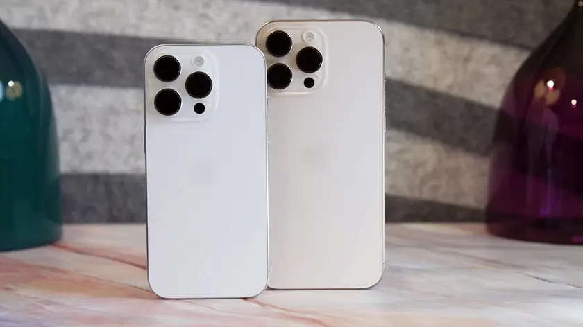
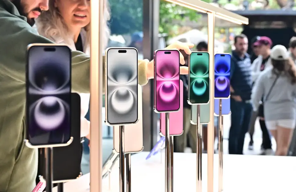
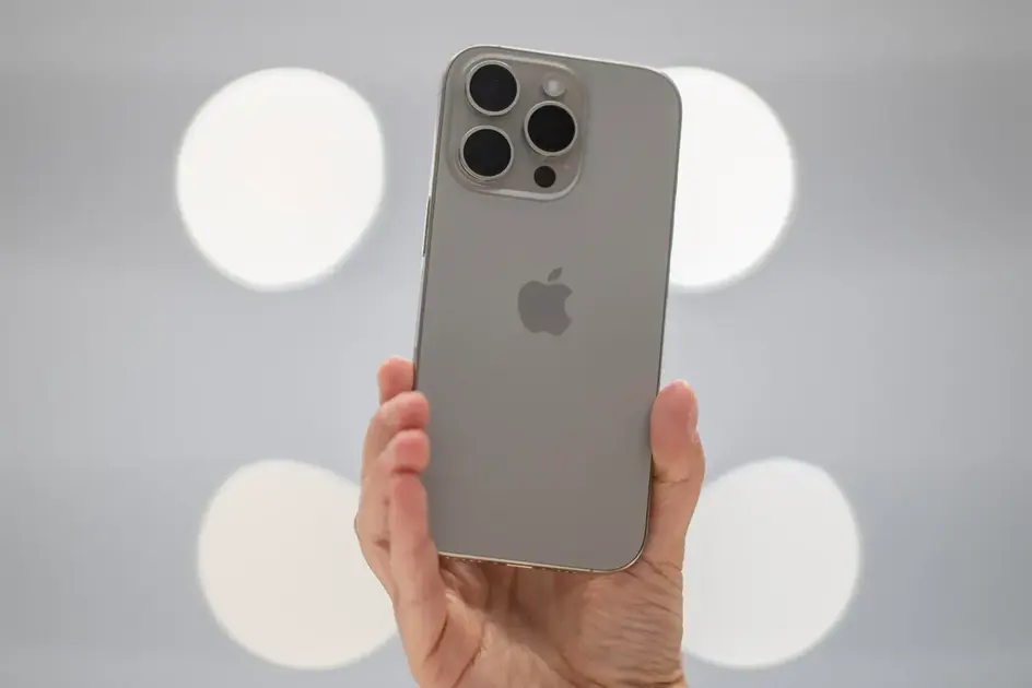
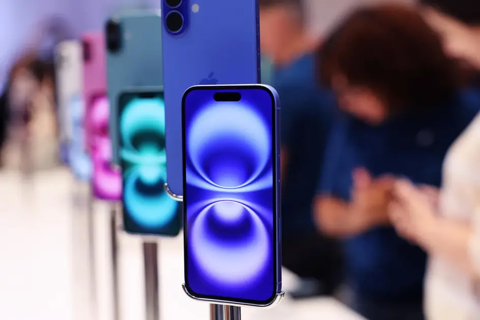
Apple is rumored to offer the iPhone 17 Pro and Pro Max in an orange shade described as copper-like, while the iPhone 17 Air is said to come in a new light blue color. The claims come from Bloomberg’s Mark Gurman in the Power On newsletter. Dummy models reportedly show a palette that also includes black, white, and dark blue, and Apple is expected to move to a part-glass, part aluminum frame for the Pro models.
The iPhone 17 lineup is anticipated to be unveiled later this year with a traditional launch cadence. If the rumors prove correct, pre-orders could begin in mid-September, followed by shipments to stores in late September.
Key Takeaways
"Color becomes a signal as much as a feature"
Editorial note on how color drives branding, not just aesthetics
"Orange on Pro marks a bold branding move"
Emphasizes the perceived risk and reward of a bright Pro color
"A pale blue Air could stand out in low light"
Describes the potential impact of the rumored Air shade
If true, the color choices reveal marketing intent more than a mere aesthetic update. Apple may be using bold hues to differentiate the Pro line from the muted titanium era and to spark renewed consumer interest ahead of the fall season.
Color branding can shape how people see a product. The light blue Air could carve a distinct identity that reduces color overlap with the Pro models, while orange for Pro risks dividing fans and creating a talking point beyond the specs.
Highlights
- Color becomes the headline even before the specs
- Orange Pro signals bold branding for a cautious lineup
- A pale blue Air may stand out in dim light
- Shade choices shape perception as much as features
Color strategy could invite mixed reactions
Bold color choices can polarize fans and complicate marketing, even as they draw attention ahead of a new release.
Color branding may become as important as the hardware itself this fall.
Enjoyed this? Let your friends know!
Related News
Apple readies iPhone 17 launch amid pricing debate
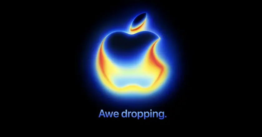
Apple teases iPhone 17 Pro features in event logo
Apple iPhone 17 release timeline
Revealed: iPhone 17 Color Changes Ahead of Launch
Apple iPhone 17 event date announced

Apple iPhone 17 release schedule outlined
Apple stock climbs on logo hints for iPhone 17
Apple confirms iPhone 17 launch dates