
T4K3.news
Cracker Barrel logo redesign triggers MAGA backlash
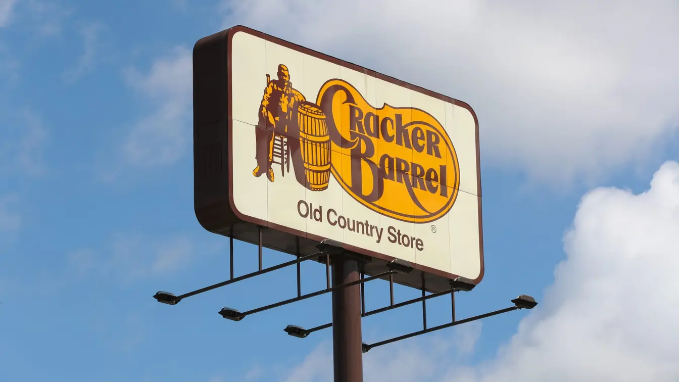
Cracker Barrel unveiled a text based logo drawing criticism from Donald Trump Jr and other conservatives.

The chain updates its logo removing the barrel man and inviting political critique.
Cracker Barrel Logo Redesign Triggers MAGA Backlash
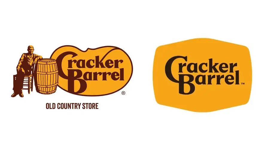
Cracker Barrel unveiled a new logo that eliminates the barrel man and the barrel image, adopting a text based mark in the brand’s gold and brown colors. The change ends a long design history dating to 1977 and becomes the first text only version since the restaurant opened in 1969. The company says the new look keeps the barrel shape and word mark while signaling a fresh energy and thoughtful craftsmanship.
Reaction arrived quickly on social media. Donald Trump Jr accused the move, while Benny Johnson called it horrible. The company defended the update as preserving legacy while embracing modern aesthetics, noting store refreshes and a broader modernization that includes DEI initiatives. The debate shows how branding decisions can become political flashpoints even for a dining chain.
Key Takeaways
"WTF is wrong with Cracker Barrel?"
Donald Trump Jr on X reacting to the logo change
"Cracker Barrel completely changed their iconic logo for the first time in 47 years and it’s absolutely horrible. When will they learn?"
Benny Johnson on social media
"Which logo change is worse Cracker Barrel or Land O Lakes"
Mike Lee comparing logo changes
"People can’t afford housing, groceries, and are going bankrupt if they get cancer. So naturally, conservatives are mad about Cracker Barrel’s logo"
Nina Turner on the backlash
"Our story hasn’t changed. Our values haven’t changed."
Sarah Moore, Cracker Barrel chief marketing officer
The logo change highlights a core tension in branding: preserve heritage while signaling relevance. In a polarized public, symbols carry political weight, and Cracker Barrel’s decision to drop the old timer and barrel invites a broader discussion about identity and inclusivity in consumer brands.
Cracker Barrel frames the update as a continuation of its story, not a break with it. Critics say the change risks eroding a familiar reference point for longtime customers. The episode also underscores how corporate messaging—valuing legacy while pursuing growth—can shape public perception and investor confidence in a crowded, competitive market.
Highlights
- Brand change without consent feels like a menu without a favorite dish
- Change is not betrayal of the past it is a test of how much a brand listens
- Customers deserve a symbol that respects history and speaks to today
- Tradition has a shelf life if you ignore the customers
Political backlash over logo change
Conservative critics and public figures have attacked Cracker Barrel's logo update, turning branding into a political moment that could affect customer relations and investor sentiment.
Brand choices will keep shaping Cracker Barrel’s public image in a changing market.
Enjoyed this? Let your friends know!
Related News
Cracker Barrel logo change triggers political backlash
Cracker Barrel logo update sparks political backlash
Cracker Barrel updates logo amid backlash
Cracker Barrel logo draws backlash
Cracker Barrel branding update triggers stock move
Cracker Barrel rebrand draws backlash in New York
Newsom mocks MAGA backlash to Cracker Barrel logo
Cracker Barrel logo change draws backlash