
T4K3.news
Apple tested iMac design with front logo
Recent leak reveals Apple considered adding a logo below the iMac screen.

A recent leak about the iMac's design reveals a unique decision from Apple.
Leaker Shares iMac Design Choice That Wasn't Made
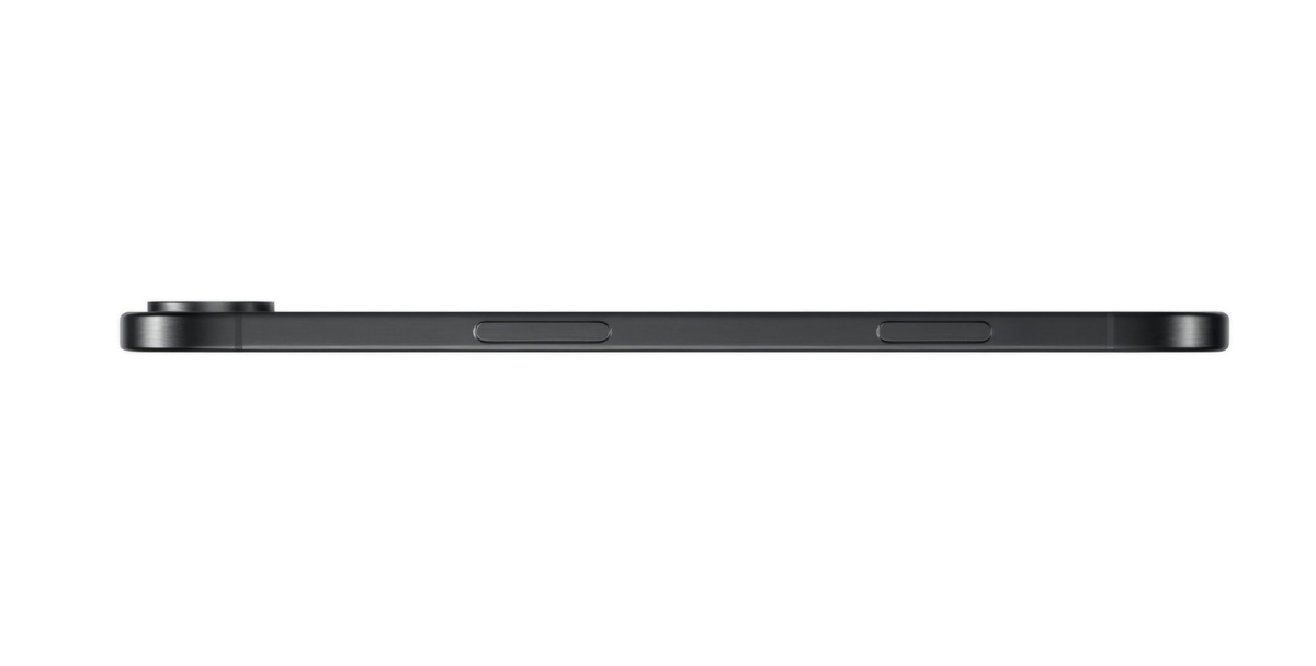
A user known as Kosutami on X has revealed that Apple considered adding an Apple logo below the screen of the iMac. This discussion arises after the iMac transitioned from Intel processors to Apple silicon in 2021, accompanied by a new colorful, ultra-thin design. However, the final version released did not feature a logo beneath the screen, nor does it in subsequent models. Despite this revelation, Apple has maintained the presence of a large Apple logo on the back of the device. This insight may intrigue design aficionados but ultimately reflects Apple's exploratory approach during the design process.
Key Takeaways
"Apple tested a version of the iMac with a logo below the screen."
This quote highlights the exploration phase in Apple's design process.
"If this sort of thing interests you, then now you know."
The quote illustrates the casual tone of presenting the leak.
The decision to exclude a front-facing logo from the new iMac could reflect Apple's design philosophy that prioritizes minimalism and sleekness. With continuous investments in innovation, Apple’s design choices seem aimed at promoting a clean aesthetic that may appeal to modern consumers. This shift aligns the iMac more with trends seen in contemporary electronics, where logos are often less visible. Enthusiasts of product designs may marvel at this behind-the-scenes look, yet it underscores a broader trend in how companies navigate branding and visual identity in product development.
Highlights
- Apple's design process often explores both sides of the coin.
- Minimalism is at the heart of Apple's latest designs.
- Exploration is key to Apple's innovative spirit.
- Not every prototype makes it to the spotlight.
Potential Impact of Design Choices
The choice to exclude a visible logo could influence consumer perceptions and brand identity in the tech market.
Such design decisions provide insight into Apple's evolving identity in the tech space.
Enjoyed this? Let your friends know!
Related News
Apple iPhone 17 leaks suggest big design changes
Apple announces potential iPhone 17 release date
Apple reveals iPhone 17 expected launch date

iPhone 17 Pro Max upgrade on the way
Samsung Galaxy Z Flip 7 now available
iPhone 17 Air features 2,900 mAh battery in new design

Apple set to release the next generation of AirPods Pro
iPhone 17 Series Announcement Date Set
