
T4K3.news
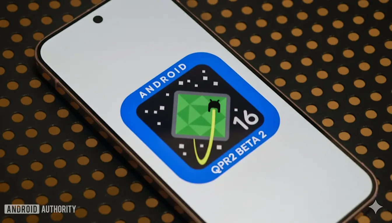
Android 16 QPR2 beta 1 released
Beta testers gain dark mode and themed icons plus parental controls and cross platform updates.


Google rolls out Android 16 QPR2 beta 1 with dark mode and themed app icons, signaling a stronger focus on accessibility and design control.
Android 16 QPR2 brings forced dark mode and themed icons
Google has begun rolling out the Android 16 QPR2 beta 1 to testers, adding a new dark theme that will invert the UI of light apps when the dark theme is on. The feature aims to help users with low vision or photosensitivity by darkening splash screens and matching status bar colors, even for apps that do not natively support dark modes.
The update also enables forced themed app icons, letting users apply color themes to icons of apps that lack built in theming. Google says this reduces developer effort while giving users a consistent home screen look. The beta adds a parental controls option and improves data migration between Android and iOS, plus other refinements noted on the Android developers blog.
Key Takeaways
"This is largely intended as an accessibility feature."
Google explains the dark theme inversion in the beta release.
"Auto themed app icons spare developers from adding this capability manually."
Explanation of the new icon theming capability.
"Parental controls on-device are pin protected and easier to manage."
New family safety settings in Android Settings.
"The move signals a broader direction for Android design that balances usability with polish."
Editorial assessment of the feature set.
The design choices reflect a push toward accessibility and visual cohesion at scale. Forcing dark mode and icon theming shifts some control from app makers to the device software, which can empower users but also risks eroding brand identity when many apps override visuals. It could stress performance or create uneven experiences across devices and apps. The addition of parental controls signals a broader move to weave digital wellbeing into system settings, while cross platform data improvements show Google aiming to smooth trading between Android and iOS. If implemented well, these updates could improve everyday usability; if not, they may add new edge cases for developers.
Highlights
- Dark mode for all means less glare and more focus
- Auto themed icons finally give home screens a unified look
- Parental controls that feel practical and on device
- Android leans into accessibility without slowing down design
As Android expands customization, users will watch how it affects performance and brand consistency.
Enjoyed this? Let your friends know!
Related News
Android 16 QPR2 Beta 1 rolls out for Pixel
Android 16 QPR2 Beta 2 released
Android expands universal icon theming
Android 17 Cinnamon Bun codename confirmed
Pixel Tablet 2 canceled as Android adds PC like controls
Android 16 QPR2 boosts on device AI controls

Android expands Identity Check to enforce biometric authentication
Android 16 QPR1 Beta 3.1 released